























Revving Up Your Brand: Car Club Logo Design Essentials
Learn key tips for designing bold, memorable car club logos that reflect your group’s identity, style, and passion for cars.

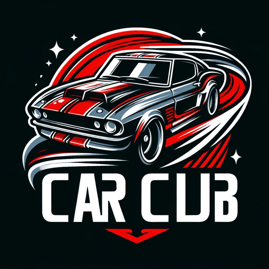
In the fast-paced business of car clubs, first impressions are crucial, and nothing leaves a stronger first impression than your logo. A professional car club logo is much more than a terrific graphic for a T-shirt or car sticker; it's a representation of identity, unity, and pride for the members. If you are a classic muscle car group, a modern supercar crew, or an off-road overland group, your logo is the foundation of your brand.
So, how do you create a logo that signifies your car club message? Let's pop the hood and take a look at the critical areas of the car club logo design.
1. Define Your Identity
Before you can pull out the sketchpad and start designing, you need to take an inventory of what your car club is all about. Do you promote vintage cars, street racing, luxury imports, or performance vehicles? Are you a rebellious club or a refined one? The identity of your club (value, aesthetic, and the community) should be the catalyst for your logo.
Consider the following:
-
What cars do we love?
-
What is unique about our car club?
-
What feelings do we want our logo to portray (power, nostalgia, speed, unity)?
Once you've honed in on your identity, it's simple to design a logo that encapsulates it.
2. Iconography: Bold and Recognizable
Strong and recognizable iconography is often at the core of great car club logos. Including:
-
Cars or car parts (grilles, pistons, wheels, engines)
-
Speed-oriented images (flames, wings, speedometers)
-
Classic car-related imagery (checkered flags, road signs)
-
Animal mascots (bull, eagle, panther)
-
Thomas More's related imagery and shields, and crests.
The iconography you use should align with your club's identity; for a classic hot rod club, the best choices might be retro badges and chrome pieces, while a tuner club could choose aggressive silhouettes with clean, modern lines, and so on.
Follow this guideline: KISS! - Keep it simple, stupid. A cluttered logo is hard to reproduce on a keyring, patch, or emblem.
3. Typography: The Good, The Bad, and The Ugly
Typography can make or break a logo. It should be bold, legible, and represent your club's identity and attitude. For instance:
-
Vintage clubs might utilize serif fonts or a custom script style with look of mid-century car advertisements.
-
Modern Performance clubs may choose sharp, angular, or futuristic lettering.
-
Off-road and Truck clubs may favor heavy block, rough, or industrial typefaces or styles.
Don't use a font that is overused, but also avoid fonts that are too thin or decorative your logo has to be quick and easy to read.
Bonus: Custom lettering can take your logo to the next level and make it unique.
4. Color Psychology on the Road
Color is about more than aesthetics. Color evokes emotion and communicates a club's personality. Here are some standard colors used in car culture and what they generally convey:
-
Red: Passion, speed, aggression
-
Black: Power, luxury, authority
-
White: Cleanliness, precision, simplicity
-
Blue: Trust, technology, professionalism
-
Yellow/Orange: Energy, caution, uniqueness
-
Chrome/Silver: Modernness, sleekness, tech
It's best to stick to a limited range of colors. 2 to 3 primary colors are optimal. This makes reproducing your logo easier, but it also looks great in color and black and white.
5. Make it Scalable and Versatile
Your logo has to look good on a bumper sticker, but also a massive banner at a car meet. So, it has to be scalable and versatile.
Try your logo in a variety of formats:
-
Embroidered patches
-
Vinyl decals
-
Social media avatars
-
merch (hats, jackets, tees)
-
Favicons for websites
Vector-based logos (built in Adobe Illustrator or a similar app) will guarantee you quality. And don't forget to make versions for each type of background: light, dark, and transparent.
6. Think Emblems
Many car clubs like to use emblem-style logos, which combine typography and graphic elements, all contained in some emblem or badge shape. This type of logo design gives homage to iconic car manufacturers and racing teams, making it an easy-to-recognize style in the car lovers' space.
Common shapes in this style include:
-
Circles
-
Shields
-
Wing shapes
-
Ovals
-
Triangles
7. Go for Timelessness Over Trendiness
Trends are trends; you don't want your car club logo to have a shelf life. Avoid any trendy fonts, complicated gradients, or Instagram filter-type styles. Remember to consider timeless features that represent the enduring spirit of your club and community.
Consider some of the classic brands like Harley-Davidson and Ferrari. Their logos are bold and straightforward, but they are full of identity. This is what you're trying to achieve.
Final Words
Your car club logo is more than just an image - it is a badge of honor. It should encapsulate the essence of your club, rally your members, and capture attention wherever it appears. If you manage to balance identity, aesthetics, and clarity, your logo will serve as fuel for the expedition of your club for years to come.
So feed your creativity, put your foot down, and create a logo that gets your brand in gear with Zenn.com.